
Overview
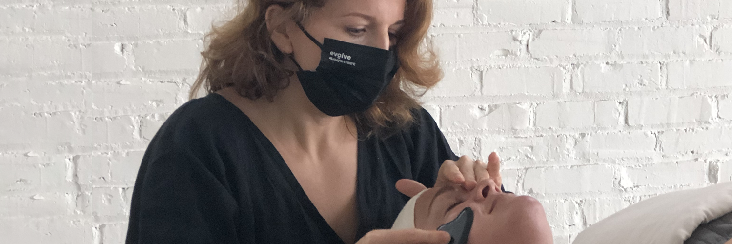
Client: Boketto Wellness, a modern apothecary, lifestyle store, and wellness treatment destination nestled in the Fan District of Richmond, Virginia
Date: October 2020 - April 2021
Scope: UX/UI Design, Frontend Web Development, E-commerce, Product Management
Technologies: Sketch, Invision, Miro, Typeform, Shopify (+ multiple apps), Adobe Illustrator, Excel
Case Study: Like many small businesses in 2020, Boketto was challenged with strict health guidelines and closures of its storefront space due to COVID-19. Previous to this time, they were positioned as a thriving and unique physical destination and their e-commerce business took a bit of a backseat.

Client Testimonial:
“Claire is so great to work with! Her approach is thorough, organized, and transparent. Now my shop’s website is more streamlined and user friendly.”
— Jelena Nikolajevic, LAc, Founder & CEO of Boketto Wellness
“Claire brings smarts, savvy, and a sincere interest in the evolution of Boketto’s digital growth. She always hits a deadline, never goes missing, or fails to up-level my understanding of UX. Saying Claire’s a valuable asset on a team, is an epic understatement.”
— Jennifer Elsner, Creative Director, Boketto Wellness
“We want to transform our unique offerings from a hyper-local experience to an expansive gloabl online reach.”
The Problem
Boketto customers need a user-friendly, well-organized, and delightful e-commerce experience because their ability to shop and receive wellness services in person has been affected due to the pandemic closures.
The Boketto team also desires to focus on expanding their business from hyper-local to a more global reach.

The Hypothesis
By redesigning their e-commerce website with improved information architecture (navigation, collection pages, product types, product descriptions, consistent product imagery), advanced search and filter functionality, and helpful resources (wellness bookings and service offerings), their online sales would dramatically increase and help grow their overall digital presence.
The “Before” Audit
Areas of Opportunity
Before diving into the front-end design, I looked into the backend to find many of the products were incorrectly set up within the product pages, affecting the site's overall information architecture. My background in buying and merchandising allowed me to point out opportunities for improving the user experience including:
Homepage- Limited information regarding the categories of products and services offered, brands carried, and lifestyle imagery to better tell their brand story.
Navigation Menu- A singular tiered menu was missing master and subcollections to help users sort through the large catalog assortment. The initial menu was set to display as a hamburger side menu drawer on both desktop and mobile, making it even more difficult for customers to see all of the collection offerings.
Product Page- Product descriptions were missing on almost all product pages, only a few products had SKUs to track individual selling analytics, and product images were all different sizes with no consistent design across the collection page.
Collection Page- Missing live text and collection copy to describe the assortment, limited existing master or subcollections to nest within the navigation, and the page filter was not set up properly to pull appropriate product features and details.


Research + Discovery
User Survey
In order to receive feedback on their current e-commerce site, I created a Boketto Wellness Client Survey.
I worked with Boketto’s Creative Director, on the copy and design of the survey email. We sent it to their highest engaged subscribers and I embedded in a pop-up on their website to increase submissions over a week period.
These participants answered a series of 20 multiple-choice and open-ended questions. The users also received an incentive $20 credit towards an order of $50 or more, generating 25% of Boketto’s monthly revenue.
Key Findings
Of 266 participants, we received 198 responses for a 75% completion rate. In hindsight, I would have edited down the questions further to increase the completion rate, but the Boketto team was happy with the overall data collected about different aspects of the company, rather than sending a second survey.
Many users provided feedback for a better user experience of their current website (which I personally loved to hear!)
Goals + Motivations
Shopping for the holidays during pandemic closures
Sleeping better, boosting immunity, meditation techniques
Skincare & body care how-to’s (73% of survey responses)
Supporting local brands
Finding a healthy work/life balance
Pain Points
Receiving services like massages, facials, etc. during COVID uncertainties ( 3.8 rating of 5 are comfortable)
Trouble finding what they’re looking for while navigating the current website
Favorite products are often out of stock
Some users don’t live in Richmond
Competitive Map
Additionally, as Boketto was not alone in this pivot, I took a look at other top wellness spaces around the country and how they were positioning their e-commerce designs during the pandemic.
The competitive map allowed me to present the top competitors that aligned with desired site features and user goals.
User Persona
The Boketto persona was defined as a full-time employed female, who identifies as She/Her between the ages of 25-35. I named her The Working Millenial Woman to align our findings with a user-centered design including typography, colors, and imagery choices.
Complete User Research Deck
Comparative Analysis
I made a point to look at each competitor’s key screens (homepage, navigation, master and subcollection pages, and product page to provide insights on everything from the newsletter sign-up incentive to filters and imagery.
I was inspired to see a variety of advanced navigation layouts that would help to assess which features would fit best within our new Boketto Shopify theme.
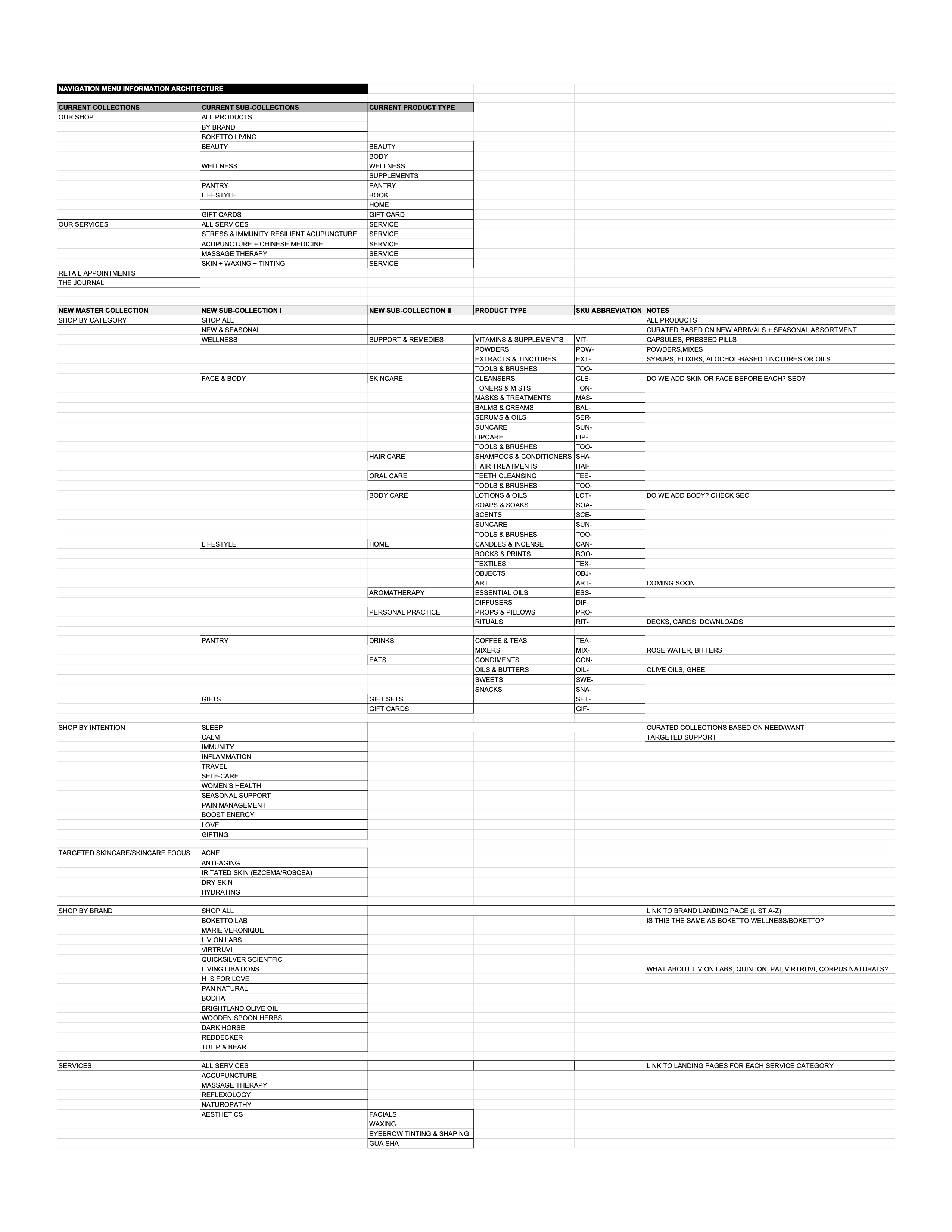
Information Architecture
Circling back to the missing product information, I assessed all current collections, reorganized/renamed, and added new subcollections to expand the navigation offerings. I also created SKU naming conventions, adjusting product titles to be more SEO friendly, and revisited product type categories for consistency and organization across the back and front end of the site.
Sketches + Wireframes
Sketches
Initial sketches of the new Boketto site design included key screens to prioritize and visualize the user flow across the site journey. Most of these influenced the back-end theme that would be purchased.
Goals for Key Screens:
Homepage- Offer a more comprehensive overview of the business, focus on new collection architectures (New Arrivals, Best Sellers, individual product categories, etc.) Wellness services, strong CTA buttons, keywords, integrating user quotes from surveys, and tell visitors how to get connected
Navigation- Expand header and footer menus with updated information architecture and horizontal desktop layout, updated account, search, and cart icons
Collection Pages- Add advanced filter/sorting, update banner header images and descriptions, redesign/resize product images to be uniform
Product Pages- Create a consistent product description template with SEO-driven keywords and backlinks, update product images, add up-sell paired products, add customer reviews
Utility Pages- About page (also updated on the homepage), FAQs, The Journal blog layout, Services descriptions and bookings
Wireframes
Based on team review during weekly Stand Up meetings, I designed low-fidelity wireframes to align with the selected back-end theme.
A top priority was to have the site feel elevated with the new lifestyle photography and to focus on holiday shopping assortments, gifting, and new seasonal curated collections as we were planning to launch mid-November.
I continued to work with the team on copy and keywords, making sure we were using succinct and relevant text wherever possible. Due to the limited launch timeline before the holiday shopping season, I began to build out the remainder of the site with Boketto’s Creative Director, to ensure the assets and branding felt aligned and sized to specs.

User Testing + Feedback
Once the new theme was updated with assets and copy, I sent a live preview link to the Boketto shop team for testing prior to pushing live. From these tests, I received the following feedback:
Remove the second button on Homepage hero banner, felt distracting and too many options
Adjust all collection cover images specs to fit the width of the page
Resize product images for featured skincare brands to be the same scale and size
Add collection descriptions to add sub-collections, as well as master collections
Adjust The Journal blog design, color scheme, and layout
Final Product

The user journey of a new customer visiting the Boketto homepage and going through the shopping check out process.
Learnings & Retrospectives
ROI Analytics
Even through a challenging year like 2020, we were able to increase online sales by +150%, online conversion to 2.65%, and returning customer rate +44% year over year.
User feedback was overwhelmingly positive, noting how much easier the online store is to navigate and how lovely the browsing and educational experience is for the Boketto shopper
Some constraints I experienced throughout the process included:
The lack of a style guide or brand identity to guide consistent colors and typography use
Somewhat limited updated lifestyle images that fit the same aesthetic for the new site
Full user integration with Wellness Services app, Acuity, for seamless bookings and payments across one backend
I continued to work with the Boketto team after the site launched to strategize and build a Boketto Membership MVP program, as well as help set up and direct their nurture campaign and email marketing efforts.