
Overview
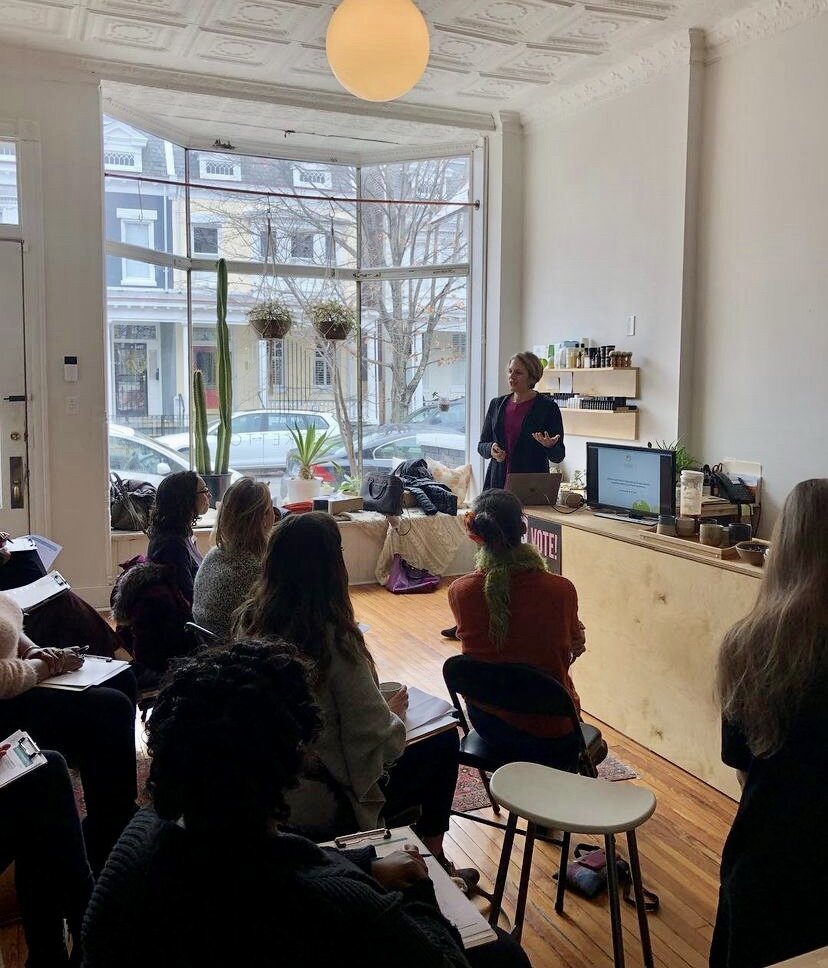
Client: Boketto Wellness, a modern apothecary, lifestyle store, and wellness treatment destination nestled in the Fan District of Richmond, Virginia
Date: February 2021 - April 2021
Scope: UX/UI Design, Frontend Web Development, Product Management
Technologies: Sketch, Invision, Miro, AAAMembership, Miro, Klaviyo, Shopify, Adobe Illustrator
Case Study: After launching their new site redesign, the Boketto team approached me to circle back on a concept we brainstormed earlier on in our partnership—an exclusive, paid membership program.
“An immersive membership program will allow us to stay connected with our loyal community and keep them engaged with all things Boketto living.”
The Problem
COVID-19 restrictions made it difficult for Boketto to connect with their community through events, workshops, and classes in person. The Boketto team also desired to find one tech solution to manage their multiple applications for loyalty, discounts, and events.
The Hypothesis
A new membership portal will enhance the Boketto community and drive brand loyalty by offering exclusive discounts, virtual events/classes, and additional rewards for a low monthly subscription cost.
Areas of Opportunity
The feedback provided from our previous user survey provided valuable insights into building this membership program, from pricing to perks and offerings.
My goal was to combine the benefits of their broken loyalty app and promotional behavior to build an MVP within 1-2 months to launch a beta version for their most loyal clientele utilizing low-cost, easy-to-use technology.
One of the biggest challenges I feared was finding platforms that were not only cost-effective but also worked together within the Shopify backend for a seamless user experience through the entire membership sign-up process and membership portal.
Research
User Survey
From our previous site-redesign Boketto Wellness Client Survey, I made a point to include questions regarding the membership program to gauge interest and get a pulse on the most desirable offerings.
I worked with Boketto’s Creative Director, Jennifer Elsner, on the copy and design of the survey email. We sent it to their highest engaged subscribers and I embedded in a pop-up on their website to increase submissions over a week period.
These participants answered a series of 20 multiple-choice and open-ended questions. The users also received an incentive $20 credit towards an order of $50 or more, generating 25% of Boketto’s monthly revenue.


Feature Prioritization & Card Sorting
Working with the Boketto team, we identified the low effort, least expensive ‘Need to Have’ and ‘Nice to Have’ features to add to the membership offerings. This allowed us to make faster decisions within a tight budget to enhance the next phase of development. The highest effort, most expensive options are left for future strategy and planning.
We completed the exercise by grouping the membership perk offering into two tiers, originally planning on launching multiple options for members.
Customer Journey Map
To streamline the new customer journey, I mapped out the signup process from the first point of awareness to user maintenance or retention. This not only allowed me to outline every step of the user’s experience, but it also helped explain the communication tools/technology used throughout for the Boketto team to manage and understand going forward.
Key Findings
The user survey and feature prioritization exercise with the Boketto team provided great insights into which aspects of the new membership program should be focused on for the initial launch and others that felt like they could be added or edited later.
Of 198 responses, 59.6% said they would be interested in a monthly membership, with the majority of users feeling anywhere betweeen $10-30 was an appropriate price for the subscription fee. Some of the top perks included exclusive discounts, birthday gifts, and free events/workshops/classes.
After reviewing the findings with the team and beginning the technology sourcing for the backend platforms, we quickly decided to only launch with Tier 1 to simplify the management and use this opportunity as a beta test stage.
Sketches + Wireframes
Initial Sketches
Initial sketches included the homepage lead generation section and the Boketto Insider Membership landing page.
UX Goals for Key Screens:
Homepage- Mobile responsive section on the main homepage with a strong CTA to link to the custom-built landing page
Landing Page- Offer succinct copy, easy-to-read sections including information for each offering, anchor links for multiple signup submission boxes
Events Page- Display monthly event information, sign-up links, and payment options for members and non-members.
LoFi Wireframes
Based on initial team feedback and review during weekly meetings, I mocked up low-fidelity wireframes and started to piece together the sign-up process for new prospective members on the custom landing page.
A top priority was to place the monthly vs. annual pricing options with a side-by-side comparison and play around with the embedded signup box vs. a pop-up signup box.
HiFi Wireframes
After receiving more feedback from the Boketto team and sourcing the technology hosts, we decided to only offer a monthly payment option of $9.99/mo and edited down some perks for the initial launch.
I built the hi-fidelity wireframe out with creative assets from the team.
We edited the FAQ copy and separated it into it's own section.
User Testing + Feedback
I tested the Boketto internal team as well as random friends/family users to provide initial testing feedback for the following adjustments:
One of the other main changes I made was switching the embedded signup submission box to a pop-up box from the CTA button.
This condensed the spacing on the page and get to the perk descriptions with less scrolling, especially on mobile.
Added more CTA buttons with anchor links to the submission button
Changed the colors and padding of the FAQ section to stand out more
Simplified the sub-heading copy and image sizes on mobile
The Final Product
The Boketto Insider Membership
This is an example of one user flow for a new customer who found the Boketto Insider Membership on the Boketto mobile homepage. Once the user becomes a Boketto Insider Member, they will also receive 3 Welcome Flow email sequences to explain more about the membership offerings.

Learnings + Retrospectives
Some constraints I experienced included:
Having a consistent user checkout experience with AAAMembership that populated the discount code without any chance of bugs/issues, especially at POS checkout.
Unable to fully integrate with Shopify + AAAMembership + Klaviyo backend, making it more difficult to automate user information, marketing triggers, and KPI reporting.
Payment processor separate from Shopify, through Stripe.
I continue to offer monthly maintenance, analytics, and email marketing consultation to the Boketto team.
Visit the Site →