Overview
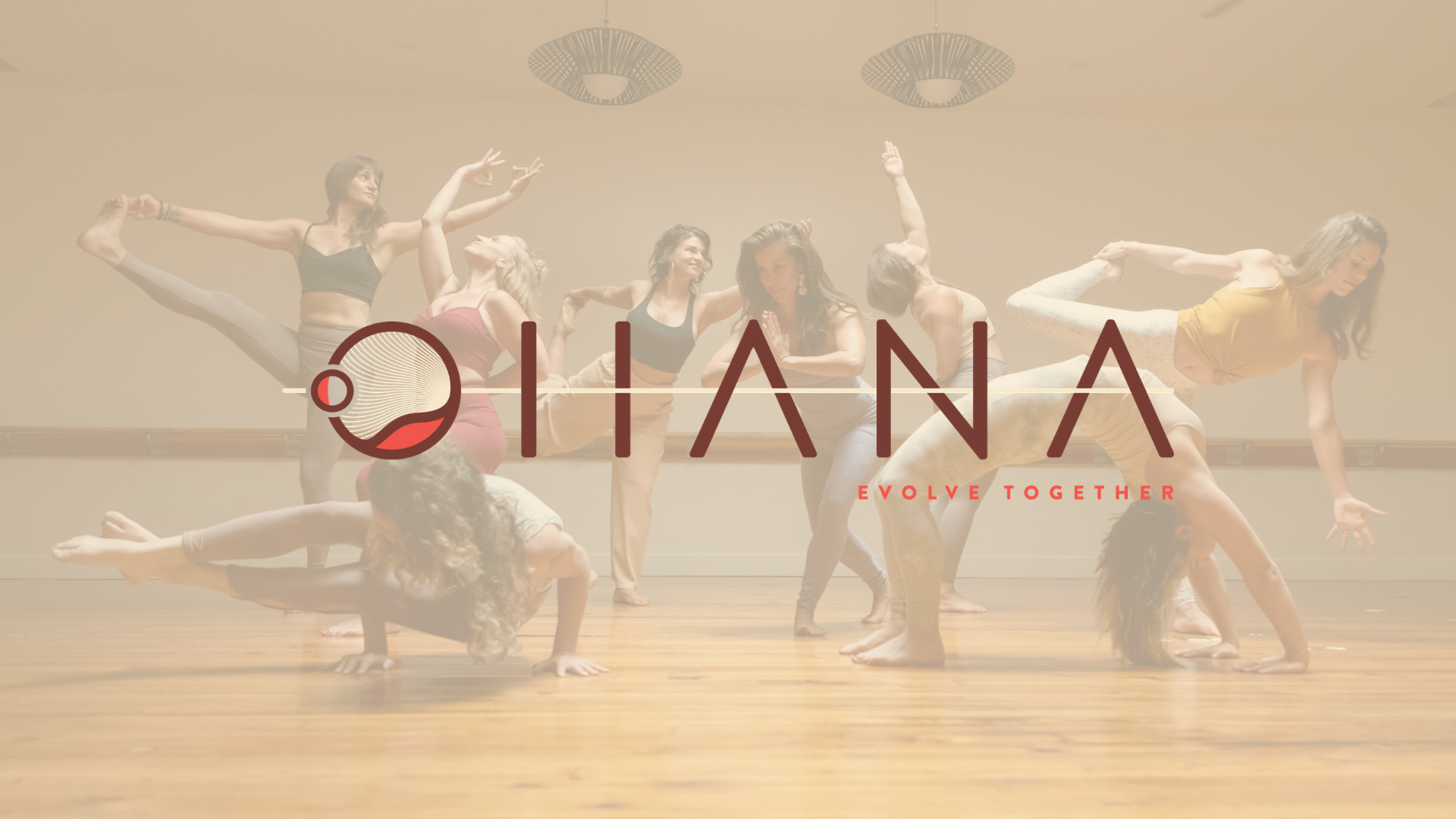
Client: Ohana Yoga + Barre, a Denver, Colorado based boutique yoga + barre studio
Date: June - November 2020
Scope: UX/UI Design, Frontend Web Development. Project Management
Technologies: Sketch, Invision, Typeform, WordPress, Union, Adobe Illustrator, Customer.io, Shopify
Case Study: As of March 2020, Ohana Yoga + Barre has been navigating studio closures and new health regulations due to COVID-19. Pivoting from a complete in-person experience, Ohana launched a virtual class platform and e-commerce retail site with hopes of maintaining their three year-old business online.

“How do we provide the same outstanding in-person experience to an online community?”

The Problem
Ohana members need convenient, affordable, and safe access to yoga and barre classes because they can no longer attend the studio in-person at full capacity.
They desire a way to improve their health, deepen personal practice, and stay connected with their community remotely during these uncertain times

The Hypothesis
By improving the website user experience to be more focused on the online platform, and by adjusting the current members-only pricing model, Ohana will retain current members while increasing new member acquisition.
Launching an e-commerce site, with a local order pick-up option, will allow clients to shop their beloved Ohana products and branded merchandise from the comfort of their home.
User Research

User Surveys
The Ohana team provided me with client emails, which were split into categories for two different surveys:
Survey #1: Current members + staff
Survey #2: Previous clients, non-members
In return for the completion of the surveys, users received a free 14-day trial of Ohana Online + $20 retail credit.

User Interviews
The Ohana team also provided me with a list of 20 users who were liked-minded practitioners, but not active members of the studio.
Of the 20 users, three replied and agreed to 10-15 minute Zoom interviews. The same interview questions were asked of all participants.
In return for their participation, users also received a free 14-day trial of the new Ohana Online platform + $20 towards retail offerings.

Key Findings
Most of the information aligned with my hypothesis and problem statement but provided great insights into additional areas of the business that need attention and improvement.
After reviewing all of the user research, I chose to name the personas Mind, Body, Spirit to align with the yogi beliefs of Ohana.
Goals + Motivations
Improve health and fitness (87.3% of survey responses)
Community, connection, and social accountability
Shorter class times (30 min)
Morning classes (8am-10am)
Convenience to practice from home
Pain Points
Health hazard and uncertainty with in-studio practice (Scale 1-5, average response was a 2.7 comfortability level)
Lack of connection or direct instruction from teachers
Missing music / playlists
Current membership price point $$$

Competitive Map
Additionally, as Ohana was not alone in this pivot, I took a look at other top fitness and wellness spaces around the country that were also forced to launch online platforms to survive the pandemic closures.
The competitive map allowed me to present the top online fitness streaming studios that aligned with desired site features and membership pricing models.

Comparative Analysis
It was helpful to see the different homepage and membership host variations and their platform features. Each competitor provided insights on everything from the sign-up process to page layouts and navigation bars to CTA buttons and conversion triggers.
I was able to assess which features would fit within our Ohana user experience, in combination with our previous user research and feedback.
The “Before” Audit
Areas of Opportunity
My primary goal was to make the membership sign-up process as simple as possible, with the new pricing model and payment options, leading with a 14-day free trial for the initial hook wherever possible. Overall, I felt the existing site presented the below issues:
Homepage- Extremely text-heavy, missing free trial option, not focused on Ohana Online, low conversion
Pricing Page- Outdated pricing / new membership offerings, inconsistent with current studio COVID-19 regulations
Ohana Online Page- hard to find on all screens, not obvious to all potential clients
Navigation Menu- Not intuitive, missing social icons + search bar, map + Facebook widget take up too much space and were not being utilized
Utility Pages- Missing important pages for updated class descriptions and offerings, client resources, and company information like FAQs, About story, and Contact Info
Feature Prioritization
By identifying the low effort, least expensive Essential and Nice to Have features to add to the new website design, we are able to make fast decisions within a tight budget to enhance the next phase of development. The highest effort, most expensive options are left for future strategy and planning.
Revised Site Map + User Flow
Building out additional landing pages allowed us to redefine the user journey and flow through the site navigation with a focus the new Ohana Online and All-Access membership and pricing options.
Sketches + Wireframes
Initial Sketches
Initial sketches of the website key screens helped to visualize the user flow and ways to promote the online business first and foremost.
UX Goals for Key Screens:
Homepage- focus on free trial CTA, new membership options, mobile responsive layout, testimonials
Pricing Page- update with new membership model + payment options
Ohana Online Page- primary presence on all pages + free trial
Navigation- update header + footer menus / add social icons + search bar
Utility Pages- add + build out pages (FAQs, T&Cs, Privacy Policy)
User Testing + Feedback
I tested the Ohana marketing team as well as random users to provide initial testing feedback for the following adjustments:
Switched user interface of homepage membership toggle from a hover to a click
Added copy to clarify two new membership options
Added new CTA copy for primary and secondary free trial + membership offering buttons / updated colors on all pages
Edited membership payment options from annual to quarterly and adjusted comps copy
Added sections for Youtube widget + promo videos
Simplified social following on homepage
Removed sign-up boxes due to limitations in Union (class platform host)
LoFi Wireframes
Based on initial team feedback and review during weekly meetings, I mocked up low fidelity wireframes and started to piece together the sign-up process for new prospective clients on each key screen.
A top priority was to place the new 14-day trial offering front and center on most of the key screens to tie back to our paid ad campaigns. I also wanted the user to understand the value of each membership offering with a side-by-side comparison and payment options (monthly vs. quarterly.)
HiFi Wireframes
After receiving more feedback from user testing and key stakeholders, I made more updates to the key screens and they were well received by the Ohana team.
I worked with the Ohana marketing team to compile an outline and edits for page copy as well as new photography and preview videos embedded on the brand Youtube page.
The Final Product

HiFi Prototype
This is an example of one user flow for a new client who was served a paid ad to visit our website and sign up for our new membership offerings. To view interactive Desktop prototype click here.
The Finished Product
Some constraints I experienced included:
Unable to fully integrate with Union class host site, taking users away from the homepage to complete the sign-up process that didn’t align with the Ohana branding or customization
The lack of a style guide or brand identity from the recent rebrand designer to guide logo, colors, and type use
Update- I ended up providing for Ohana later after the site launch, which you can view here.
Replicating an existing theme/skin and user journey of the site from the previous outsourced web dev team that was not part of the internal team strategy for the new offerings
I continued to work on multiple aspects of the site and also handled the web development of the backend for the updates to Yoga Classes, Barre Classes, and their first 200-hour Online YTT (yoga teacher training) sign-up and information landing page.